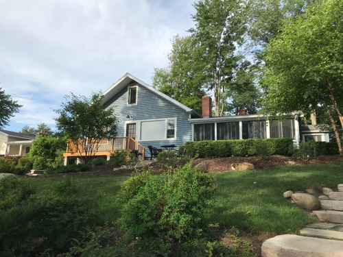
You know that one about the two best days in a vacation homeowner’s life?

The day you buy it. And the day you sell it.

lake house bedroom

Our lake song began five years ago this very weekend.

That was the time we borrowed my sister’s place. It was the first time in years that we had all our kids together at the lake. We were awash with familial love and togetherness.

And then I saw the For Sale sign.

lake house for sale.jpg

Despite his protestations of, “We are not doing this again,” it was mere weeks before my husband found himself covered in mouse poop and acorns as we removed insulation from the ceiling. I say, “We,” because much like Jim and Marlin on Mutual of Omaha’s Wild Kingdom, he wrestles the alligators, mice, squirrels and bats while I chronicle events. She who sits and writes also serves.

This is much on my mind this morning as I grab coffee and walk to the porch for a quick scroll through Instagram before doing my writing exercises ahead of the morning hordes, who will no doubt render my keyboard if not mute, certainly moot.

It never ceases to amaze me, the feelings I have when I see the sun on the lake in the morning. We don’t own a boat and I jump in the lake approximately every third year - I wouldn’t call myself a water person. But there’s something so incredibly Zen about looking out on the water from my perch on this porch…my attitude gets an immediate adjustment.

lake house porch with sunflowers.jpg

Interestingly, to me anyway, the porch weighs on me when we’re not here. It’s long and narrow with a low ceiling and it leaks like a sieve. The ceiling has been opened at the far end, revealing stained and rotting rafters, to allow for the free flow of water as roof leaks are tracked and repairs attempted. The leak of long standing necessitated replacing a few floorboards and the floor got a fresh coat of paint. To protect that effort, buckets dot the floor when we’re not in residence. When we’re here, as this morning, they sit stacked in the corner.

lake house leaking roof.jpg


Built in the late ‘50’s, the porch is an addition to the front of what started as a one-room cabin. The original windows thus open out onto the porch, cutting into key real estate in the space. After a few bumps and bruises, strategically placed benches directing traffic around the open windows have trained us to maneuver with fewer mishaps. The front side of the porch is lined with sliding windows that, despite the screens we had made for them, require vacuuming bug corpses out of the tracks in order to slide the windows open to the lake air.

At the near end, we have our growing rock collection. Rock painting has become the past time of choice for our grandchildren and the porch is both studio and gallery. I had assumed we’d be releasing rocks back into the wild, but no. The ledge that lines the windows is perfect display space.

lake house rock ledge.jpg

Not unlike the Zen I get from the view to the water, I find something restorative about the porch itself, even in its ramshackle state. I think about what we might someday do to this space, an ethereal second or third phase plan, to correct the leaks and improve airflow and overall functionality. Should we find a way to salvage the original structure? Is it wiser and more cost effective to remove and replace it?

This morning as I scroll through Instagram lake house hashtags, the polished perfection of space after space stands out in marked contrast to my little happy place. The grandeur and luxury of some of the homes is stunning. As a designer…as a person with a pulse…I love to pore over these images. But none of them capture the feeling that I had when I walked out onto the porch this morning. None of the images captures what it is I’m looking for.

As I sit on the porch, looking at both the minor imperfections and major flaws, I find myself a little resistant to the ‘remove and replace’ option. It’s not so much about respecting the history or integrity of the original structure – which is something I’m always mindful of in my work, but respecting the history of us, the tapestry of our family. Sure, I’d like not to worry about the rain and ice dams. I’d like the chipmunks not to run show on the patio or in the crawl space; I’d like to leave the windows open without worrying about somebody getting a black eye. But I want to avoid something that looks so new, polished and perfect that it doesn’t represent us.

I love good house porn. I appreciate what goes into styling for a photo shoot and what judicious editing can do. But I’m looking for real life. I’m longing for spaces that are lived in. I wish that I were a photographer with skills sufficient to capture what it is I see, with my eyes and my heart, when I walk out onto the porch.

Truths reveal themselves to me this morning.  Maybe you see what it is you’re looking for. And luxury is where you find it.

lake house lawn and landscaping.jpg


Pssst…House Porn.

I might have a problem.

When I was a young woman and could squeeze a few bucks from the grocery budget, I’d pick up the occasional copy of Better Home & Gardens. It didn’t take long to pick up on the fact that not only was a subscription rate way cheaper, but subscribers got their fix days earlier than the poor fools hanging out at the newsstand waiting to pay cover price.

I was hooked.

In the years between then and now, I escalated from the soft stuff, magazines, to the hard cover stuff – coffee table books and compendiums of window treatments. My dependence has resulted in copious amounts of time and money poured into my habit; not to mention missed social obligations from falling down the rabbit holes of Pinterest and Instagram and occasionally forgetting to eat. Okay, well, not that.  But it could have happened. For many of these years, I’ve had a good cover: as a design student, house porn was required reading; as a working designer, it’s called Research and Development.

magazine house porn.jpg

soft cover stuff

I’ve been reflecting on this because of my growing collection of soft core stuff – those magazines are taking up a fair bit of real estate in my little office. Not quite the stash of my grandfather’s National Geographics, but voluminous nonetheless. Current subscriptions include House BeautifulThis Old House, and Country Living, as well as the previously noted BH&G, (continuous since 1981!). I find this group more relatable, certainly the design more attainable than say, Architectural Digest. It’s a growing collection, because while the idea of leisurely leafing through a magazine is seductive…what is this leisure? The time available to feed my habit is inversely proportional to my stash, making it more prudent to get quick hits on my iPhone and send the magazines straight to the shelf. Kicking the paper habit is hard. What are the chances of getting the publishers to put production on hold while I catch up on the backlog? Right.

So I was contemplating both the recycling bin and cancelling my subscriptions when my deus ex machina arrived in the form of the FedEx guy delivering an advance copy of Sandra Espinet’s new book, Barefoot Luxury.

How to say…SQUIRREL!

barefoot luxury cover.jpg

The package included a cover letter from Andrew Joseph PR requesting I consider reviewing the book and posting on social media. Crazy. I had literally just listened to Sandra Espinet on an episode of my favorite podcast, LuAnn Nigara’s A Well Designed Business.

Up front, I have to tell you that Espinet is a luxury designer with a capital Luxury. Me? Not so much. I almost passed on this podcast episode precisely because she is so high end. But I’m glad I tuned in, because in the interview, I found her to be engaging and down to earth. I enjoyed listening to her espouse her position on designing from a perspective of what you know and addressing topics I’ve been struggling with internally. Espinet’s thoughtful views and approach to design and business gave me much to think about, and I was excited and flattered to have the opportunity to review her new book.

Honestly, I generally steer clear of the high end market – it isn’t where I come from and, generally speaking, it isn’t what my clients are looking for. Beyond affordability, my first thought tends to be: who’s going to clean that? In our house, it’s me. While my husband might not see it that way, if there’s going to be cleaning done, I’m in charge. So high end design is often off-putting to my practical side. (Yes, honey. I do have one.)

Barefoot Luxury delivers some serious hard cover house porn. Hector Velasco Fazio’s photographs are just what you might expect: breathtaking. They capture the depth of Espinet’s impeccable sense of design, color and context; and the soaring scale of situation and space.  

But I read it for the articles. Really.

The book is over 200 pages, most overflowing with photographs and accompanying descriptors, and just 13 devoted primarily to prose, but those were the pages that captured my interest. Sandra Espinet is an engaging writer, at once hip historian, design docent and intriguing insider. Her words breathe more life into this luxury design travelogue than I would have imagined. I love her background info on tourism in Mexico and the rise of the private communities to which she caters. I appreciate her approach to design which includes a respect for the local community, its artisans and natural resources.

The press packet that accompanied my copy of the book included Espinet’s definition of the concept of barefoot luxury as “the ultimate way of living freely without pretense yet still with elegance and style”. Although I might take issue with the concept of living “without pretense” in one of these Mexican coastline retreats, I can’t argue the “elegance and style”. I think that’s what I liked most about the book – the designs are thoughtful embodiments of what her clients are looking for. They capture how her clients want to feel in their spaces, without trends or gaudy excess. That’s the kind of design I believe you strive for at any price point.

barefoot luxury at the lake.jpg

I brought the book with me on a weekend trip to our little camp in the Adirondacks – lightyears from Mexican Resort Living and devoid of pretense. We have our own special style, though we might be light on the elegance. It was interesting to juxtapose Espinet’s elegantly manicured and maintained resort-style retreats with the reality of our fixer upper at the lake. Call me clueless, but it is one of life’s little ironies that our vacation place is exponentially more work than anticipated. Camp maintenance is not unlike my magazine stash: inversely proportional to the leisure to enjoy it. No staff to prep the place for our arrival, no one to set the Adirondack chairs out on the patio. 

But the thing is…there is a patio, no shoes required.

Luxury is where you find it.

barefoot luxury sunset on the dock.jpg